Responsive Web Design (Continued) will automatically adjust for different screen sizes and viewports. Refer to EBook Appendix C. Responsive Web Design Technical Considerations.
Because our course objectives require learning about responsive web design, we will develop structure using responsive headers and columns.

See below and Blackboard for details.
A website is often divided into headers, navbar menus, content and a footer and often depends on the target users. We have the responsive navigation menu bar now. Today we develop the header below it and add a responsive two-column structure below our bullet lists. Follow the instructions below:
Although content is the reason for visiting, the 'Header' is the first critical structure that attracts attention and should be memorable enough to retain it. It is a critical point that makes or breaks websites!


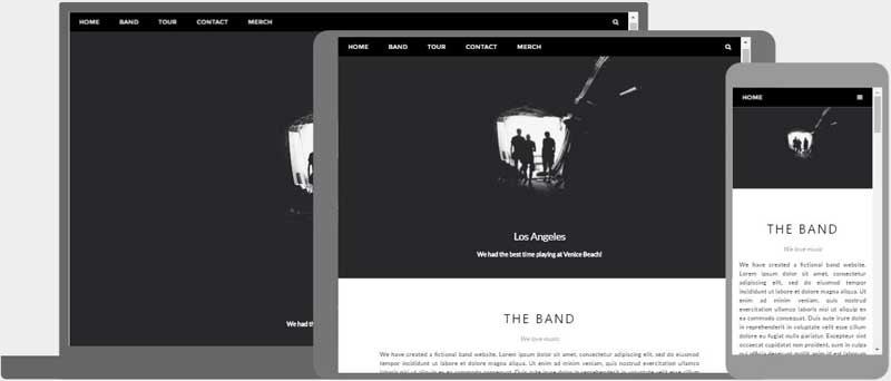
How the content of a website should be shown, often depends on the device of the users. The most common layouts are:
|
Resize the browser window to see the responsive effect (the columns will stack on top of each other instead of floating next to each other, when the screen is less than 600px wide).
1-Column Layout
...often used for mobile browsers.
Background Color: #f2f2f2
Text Color: #000
2-Column Layout
...often used for tablets and laptops.
Background Color: #66ccff
Text Color: #000
2-Column Layout
...often used for tablets and laptops.
Background Color: #3399cc
Text Color: #fff
3-Column Layout
...most often only used for desktops.
Background Color: #66ccff
Text Color: #000
3-Column Layout
...most often only used for desktops.
Background Color: #3399cc
Text Color: #fff
3-Column Layout
...most often only used for desktops.
Background Color: #006699
Text Color: #fff
4-Column Layout
BG: #66ccff
T: #000
4-Column Layout
BG: #3399cc
T: #fff
4-Column Layout
BG: #006699
T: #fff
4-Column Layout
BG: #003a56
T: #fff
5-Columns
BG: #f2f2f2
T: #000
5-Columns
BG: #66ccff
T: #000
5-Columns
BG: #3399cc
T: #000
5-Columns
BG: #006699
T: #fff
5-Columns
BG: #003a56
T: #fff


Replace 'Intro' placeholder text: A website is often divided into menus, headers, content and a footer for page structure and hierarchy of information which makes content aesthetically pleasing and easier to understand. How you organize content makes all the difference in web design.
Replace 'About' placeholder text: Although content is the reason for visiting, the 'Header' is the first critical structure that attracts attention and should be memorable enough to retain it. It is a critical point that makes or breaks websites!
Replace 'Purpose' placeholder text: Columns are fundamental in web design because they organize the bulk of your content. 1-column is the most common layout and often used for mobile browsers, 2-column is often used for tablets and laptops, and the 3-column layouts are used sparingly and mostly for desktops.
Replace placeholer title and text: Resize the browser window to see the effect! Lorem ipsum dolor sit amet consectetur adipiscing elit, sed do eiusmod tempor incididunt ut labore et dolore magna aliqua. Ut enim ad minim veniam, quis nostrud exercitation ullamco laboris nisi ut aliquip ex ea commodo consequat.
Replace this content with your own. Lorem ipsum dolor sit amet consectetur adipiscing elit, sed do eiusmod tempor incididunt ut labore et dolore magna aliqua. Ut enim ad minim veniam, quis nostrud exercitation ullamco laboris nisi ut aliquip ex ea commodo consequat.
Replace this content with your own. Lorem ipsum dolor sit amet consectetur adipiscing elit, sed do eiusmod tempor incididunt ut labore et dolore magna aliqua. Ut enim ad minim veniam, quis nostrud exercitation ullamco laboris nisi ut aliquip ex ea commodo consequat.
