RWD - Responsive Web Design will automatically adjust for different screen sizes (large monitors, TVs, desktops, tablets, and mobile phones). Refer to EBook Appendix C. Responsive Web Design Technical Considerations. Course Outcomes 4, 5, 6 & 7.
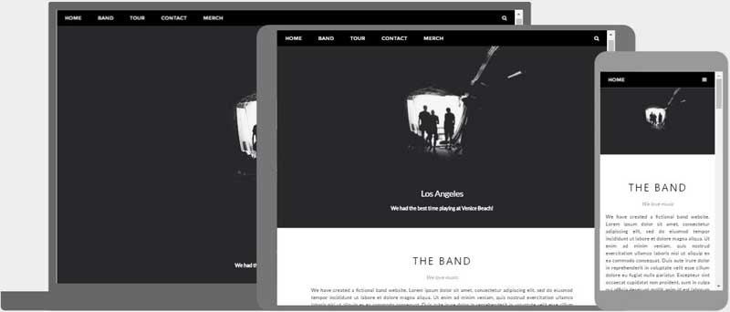
The goal of responsive web design (RWD) is to use HTML and CSS to optimize websites to "respond" to multiple device types and screen sizes (device-independent) to automatically resize, hide, shrink, or enlarge, a website, to make it look good on all devices!
Mobile-first is a web design trend that encourages web designers to first design for mobile devices, rather than standard laptop or desktop monitor sizes. Let's discuss the five main goals according to —Webflow.com
1. Design for touchscreens. Design with taps, swipes, and pinches in mind. Make sure interactive elements accommodate finger-sized touch zones. —Webflow.com
2. Simplify navigation. Keep menus simple, straightforward, and intuitive. Prioritize core content, (home, about us, and product pages), and remove heavy elements... —Webflow.com
3. Optimize for speed and performance to retain mobile users who expect quick access and seamless interactions. Optimize graphics, images, videos, and code to ensure fast page loading and swift response times ... —Webflow.com
4. Conduct usability testing. Test your mobile designs under various conditions to make sure they stand up to real-world use. Evaluate performance across network speeds, device orientations, screen sizes, and hardware capabilities... —Webflow.com
5. Design progressively Start small and scale up. When adopting a mobile-first strategy, start with the basics that work well on smartphones and tablets, then gradually add features and expand your design perspective as you have more space... —Webflow.com
Course Learning Outcomes 2, 4 - 7: 2. learn the Basics of HTML5. 4. learn what CSS is and how to use it. 5. design for mobile devices. 6. design for tablets and desktop devices. 7. improve Web Design.
The most important consideration when creating a mobile-friendly website or applying RWD practices is to simplify the navigation and content to accommodate a smaller screen size and the use of a stylus or touch screen. You can address the bandwidth differences by reducing the number of images and replacing paragraphs with lists to ensure that interactive website experiences are easy to do on a mobile device.
Let’s start with the top of the page with a responsive navigation bar. Links between pages makes it easy for visitors to click through the website quickly to find useful information— fewer clicks mean more satisfied website visitors.
The meta Element is typically used to specify the character set, page description, keywords, author of the document, and viewport settings. The metadata will not be displayed on the page, but is used by browsers (how to display content or reload page), by search engines (keywords), and other web services. The viewport is the user's visible area of a web page. The viewport varies with the device (will be a lot smaller on a mobile phone than on a computer screen). You should include the following elements in the
section of all your web pages in the future.Links are found in nearly all web pages. They allow users to click their way down a page to page or from page to page.
You can click on a link and jump to another document. When you move the mouse over a link, the mouse arrow will turn into a little hand. Note: A link does not have to be text. A link can be an image or any other HTML element!
The most important attribute of the 'a' element is the href attribute, which indicates the link's destination. The link text is the part that will be visible to the reader. Clicking on the link text, will send the reader to the specified URL address.
HTML links can be used to create bookmarks, so that readers can jump to specific parts of a web page.
Use the href attribute (href="#value") to link to the bookmark and use the id attribute (id="value") to define bookmarks in a page (both seen in your future top navigation bar we create today).

|
Blackboard Login > Course > Activate eBook > |
See below and Blackboard for details.


Replace 'Intro' placeholder text: Responsive Web Design (RWD) optimizes your website for multiple device types and screen sizes (device-independent). Resize the browser window to see it work!
Replace 'About' placeholder text: Responsive Web Design is about using HTML and CSS to automatically resize, hide, shrink, or enlarge, a website, to make it look good on all devices. Check it out!
Replace 'Purpose' placeholder text: The purpose of a navigation menu with relative or absolute hyperlinks is to target bookmarks on the same page or link from page to page. Open a link to see how it!


